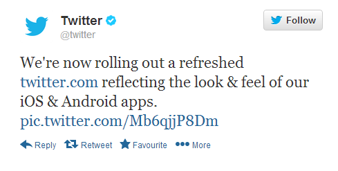
On Monday, Twitter announced that They are now rolling out a refreshed Twitter homepage which will be inspired by the look and feel of their recently updated mobile apps on Android & iOS.

As of now, the current design does not match the mobile apps design, but now it seems, the company is committed towards bringing a universal design for all platforms and to provide users more options to choose from to customize and personalize their profiles as the social networking site posted on its official account @twitter, explaining how to personalise one’s profile going into the settings. Another tweet from its official account read,[Note]”At refreshed http://twitter.com , personalize your profile w/ accent color: http://twitter.com/settings >web design. pic.twitter.com/y7r1a6jqxl“[/Note]
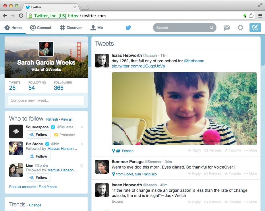
Have a look below at the old and the new design, noticed any difference?
Old design:
New Design:
So From These screens I guess you could easily make out that the toolbar on the top is now white instead of black, the font sizes under a user’s profile picture have grown larger and cover photo are now aligned behind the profile picture on the homepage too (which earlier was visible on the profile page only). the new design has already began rolling out to users from Monday and it should be available to everyone in the coming days.
source – Twitter
Dont Forget to like us on facebook and follow us on twitter, to stay updated


